Ice cream shop in Gdańsk - Szyszka Ice-cream
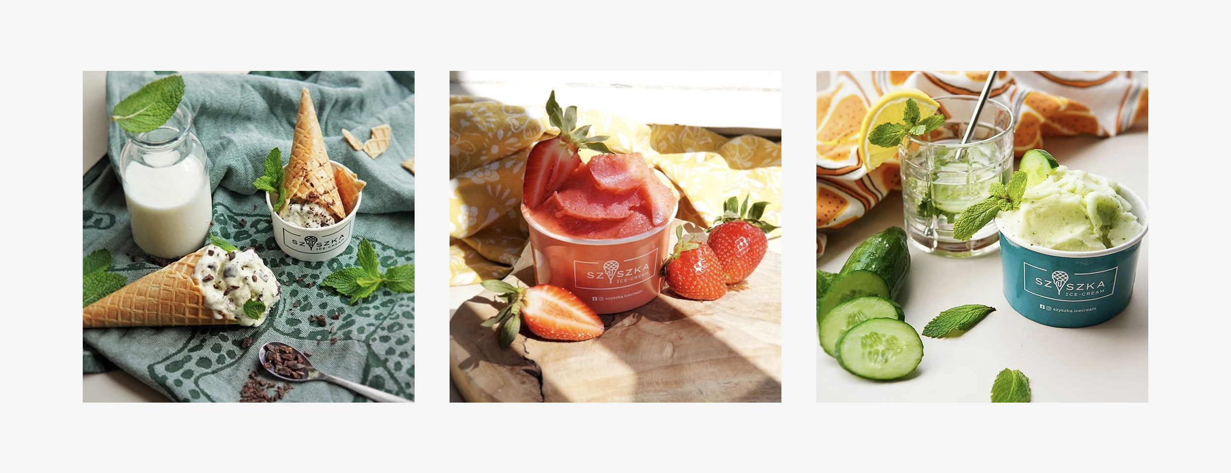
Szyszka Ice-cream is a new ice cream shop on the map of Gdańsk. Its name refers to its signature taste - "Cone" - polish sweets made of puffed rice. The owners of Szyszka value quality and originality. They focus on the best ingredients and bold flavors.
In the branding project, I focused on similar values. I combined simple typography with soft, flowing shapes. Thanks to this, the visual identification of Szyszka is both solid and fresh.
Year
2021
Task
Branding
Interior elements
Graphic ornaments
Client
Szyszka Ice-cream
Photographs
Kamila Kogut
Logotype
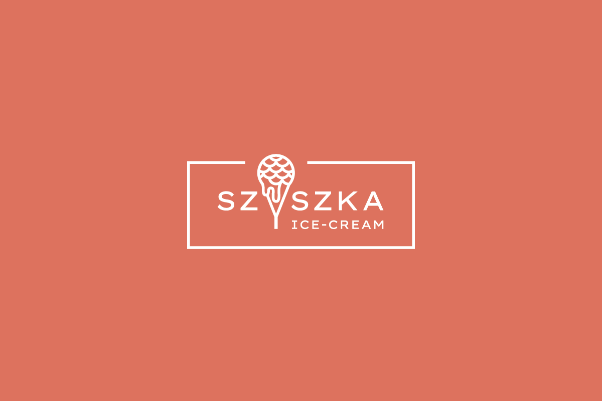
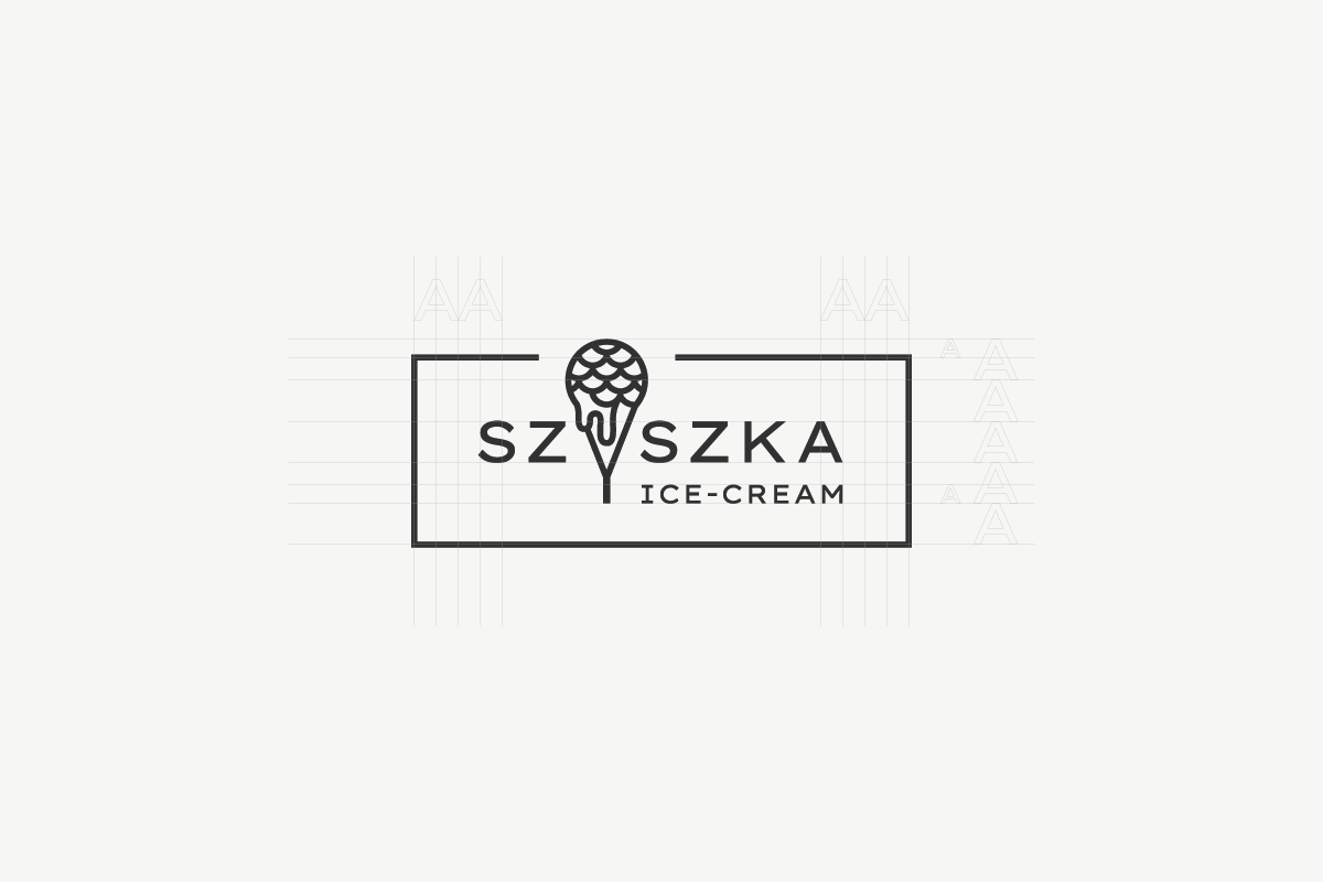
The logotype uses simple sign typography. The letter Y is replaced by a sign that combines the symbol of ice cream in a cone and a reference to a pine cone. The composition is enclosed in a frame, which further emphasizes the sign character of the logotype and evokes associations with craftsmanship.
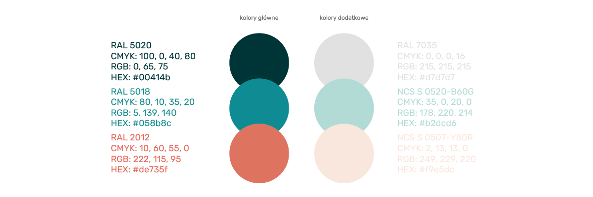
Colors
The leading colors of the branding are vivid, bold colors. Marine, blue-green shades contrast with intense salmon orange. They are complemented by their bleached counterparts, which provide a perfect background.
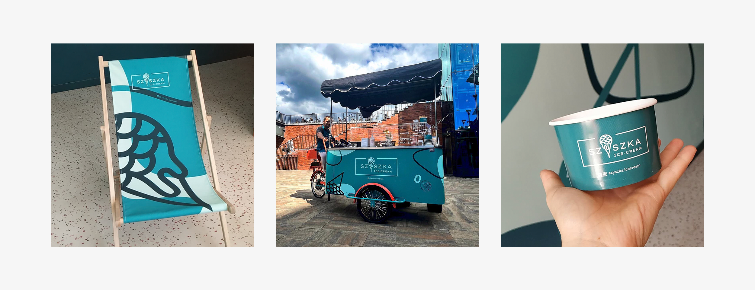
Blues and oranges are used side by side, but do not overlap. They create monochromatic spaces. This tactic was used in the interior, in online and printed materials.

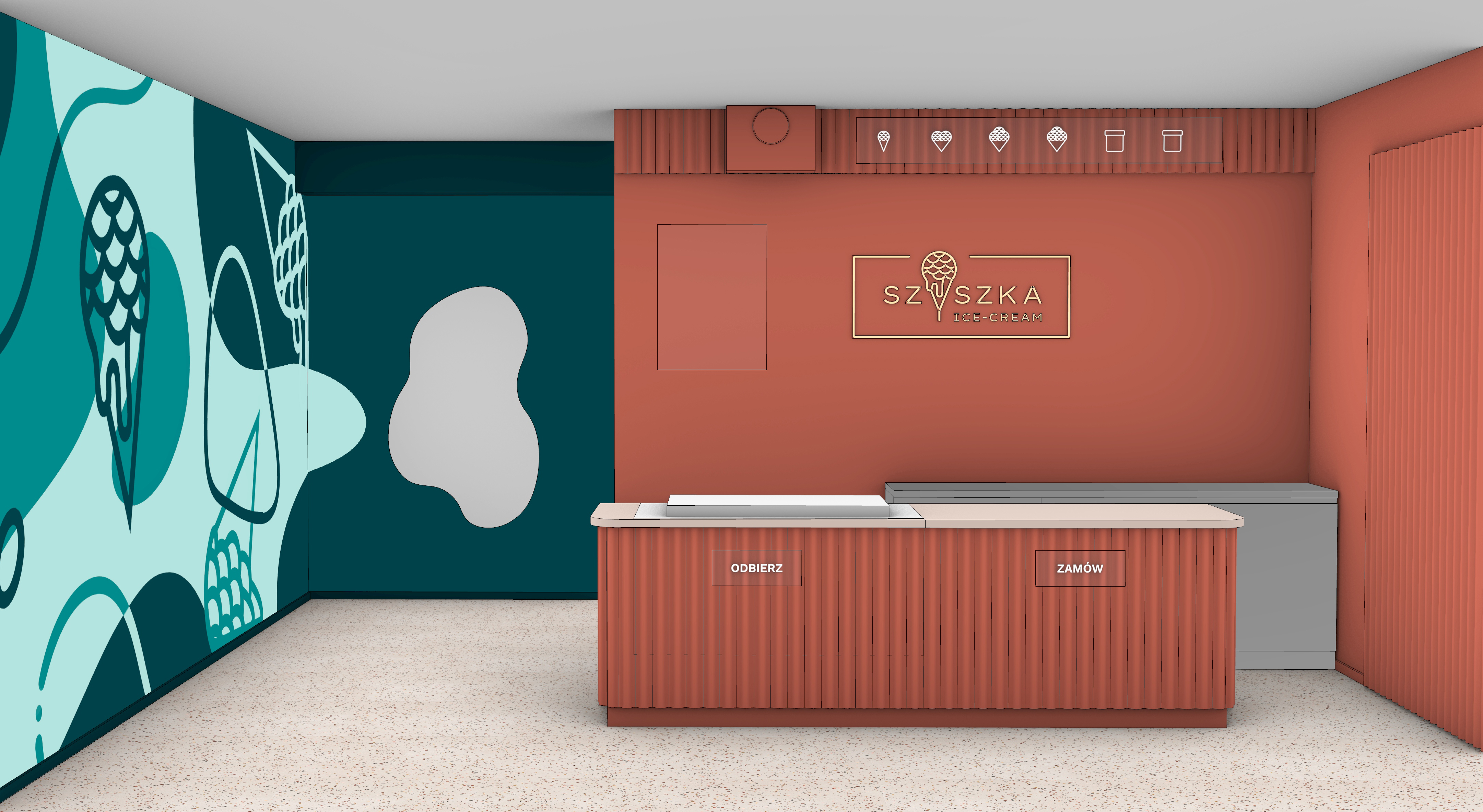
Interior
The interior of the ice cream shop is consistent with the branding. Vivid colors of the walls, graphic motifs in the form of a mural, a mirror resembling melted ice cream and a logotype in the form of a neon sign in the central point make up a very expressive space.
The owners of Szyszka knew what they wanted from the interior of their ice cream parlor, and I helped them achieve it.
Graphic ornament
Colorful spots and lines as well as ice cream symbols referring to the logotype create a graphic motif that has found many applications. It was used as a mural in the interior, a print on deckchairs, covering a food cart or a background for posts in social media.
